
Why Mobile-Responsive Websites Are Essential for Businesses
Did you know that over 70% of online browsing and shopping now happens on mobile devices?
Yes, you read that right. People today aren’t glued to desktops anymore; they’re scrolling, shopping, and interacting while sipping coffee, commuting, or winding down before bed, all from their smartphones.
Now imagine this: a potential customer lands on your business website from a Facebook or Google ad. They’re interested, ready to take action… but your site takes forever to load, the buttons misalign, and the contact form crashes on mobile.
What happens next?
They leave and head straight to your competitor, who offers a fast, mobile-friendly website that loads perfectly.
That’s the reality of today’s digital marketplace.
In this mobile-first world, how responsive your website design is can determine whether users stay or bounce. A smooth, visually appealing, mobile-responsive website builds trust, enhances engagement, and directly affects sales.
At Artxpro Global, a Texas-based Digital Marketing Agency, we’ve seen firsthand how a well-optimized, mobile-responsive design can completely transform online performance, boosting visibility, conversions, and customer loyalty.
So, let’s dive into why having a mobile-responsive website isn’t a luxury anymore; it’s a necessity for every business.
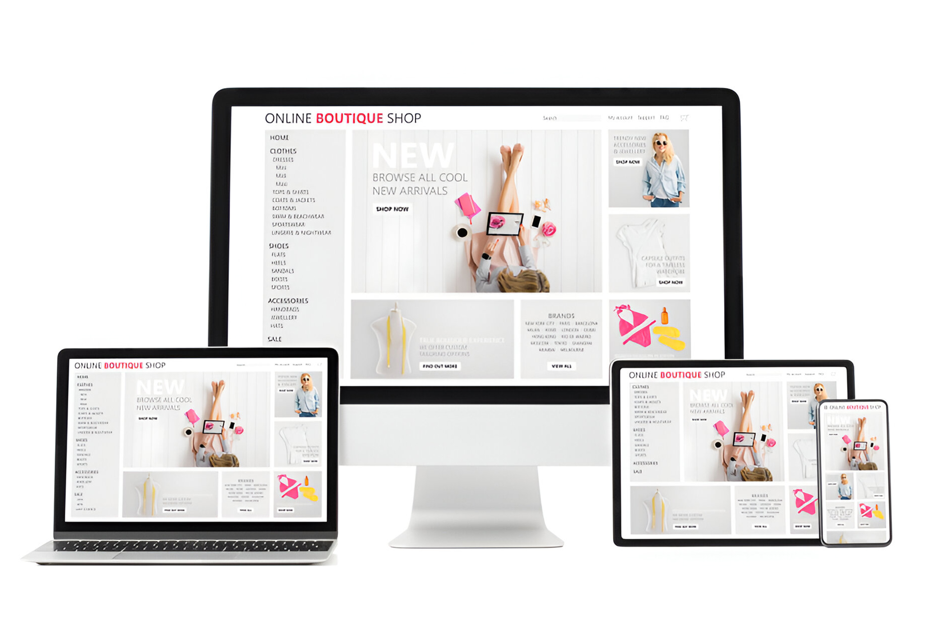
What Is a Mobile-Responsive Website?
Let’s break it down. A mobile-responsive website automatically adjusts its layout, content, and visuals based on the screen it’s viewed on.
Think about it: one visitor might be browsing your site on a 6-inch smartphone, another on a 13-inch tablet, and another on a 27-inch desktop monitor. A responsive web design ensures your website looks equally stunning and functional on all devices with no awkward zooming, scrolling, or broken layouts.
It’s like designing one perfect outfit that fits everyone, no matter their size.
However, people often confuse mobile-friendly websites with responsive websites and there’s a big difference:
- A mobile-friendly website may fit a mobile screen, but it often feels cramped and static.
- A mobile-responsive website, on the other hand, adapts dynamically to every screen and provides the best possible user experience.
And in today’s fast-paced world, a seamless mobile experience isn’t optional, it’s everything.
Why Mobile-Responsive Design Matters for Businesses
You might wonder, “Does it really make that big of a difference?”
The short answer: Absolutely.
Here’s why the importance of responsive design can’t be overstated:
Better User Experience
No one enjoys struggling with tiny buttons or sideways scrolling. Mobile-responsive websites ensure visitors can easily browse, read, and interact. This translates into higher engagement, longer session times, and better satisfaction.
Increased Sales & Conversions
Whether you’re running an eCommerce store or a local service, a responsive design can dramatically improve conversion rates. When your site works flawlessly across devices, users feel confident completing a purchase or contacting your business.
That’s why at Artxpro Global, we build responsive websites for eCommerce that are optimized for smooth checkout and fast mobile performance.
Reduced Bounce Rate
Ever left a website immediately because it looked messy on your phone?
Exactly. That’s what your audience does too.
A clean, mobile-optimized layout keeps visitors browsing longer, improving user engagement and conversions.
Brand Credibility
A mobile-optimized website gives your business instant credibility. It says, “We care about our users.”
In the digital era, attention to design details builds trust, and trust builds loyalty.
Designed for Local Reach
If you’re running a local business in Texas, your audience is searching on mobile. Queries like “plumber near me” or “digital marketing agency in Texas” dominate search trends.
Having a mobile website design for local businesses ensures you appear in those search results and convert nearby leads efficiently.

SEO Benefits of Mobile-Responsive Websites
Let’s be honest, a beautiful website is useless if nobody can find it.
That’s where mobile SEO and responsive web design go hand in hand.
Here’s how responsive websites directly improve your rankings and visibility:
Google’s Mobile-First Indexing
Google ranks sites primarily based on their mobile versions.
If your site isn’t responsive, your ranking drops simply because of that.
Mobile-responsive websites signal to Google that your business prioritizes accessibility and user experience, which can dramatically improve your SEO rankings.
Faster Loading, Higher Rankings
Both Google and users love speed. A slow mobile site increases bounce rates and hurts performance.
Responsive websites load faster, especially when optimized with compressed images and clean code, boosting visibility and conversion rates simultaneously.
Improved Core Web Vitals
Your site’s Core Web Vitals, including loading speed, interactivity, and visual stability, directly affect SEO. A mobile-responsive design ensures these metrics are strong, signaling Google that your site is trustworthy and user-friendly.
Voice & Generative Search Optimization (AEO + GEO)
With AI-driven tools like Google Gemini, ChatGPT, and Alexa, search has evolved. These engines prioritize well-structured, mobile-optimized websites when delivering answers.
At Artxpro Global, we don’t just optimize for SEO; we integrate Generative Engine Optimization (GEO) and Answer Engine Optimization (AEO) strategies so your site appears in AI-powered snippets and voice results.
That means when someone asks, “Why are mobile-responsive websites important for businesses?” your content can be the one AI reads aloud or displays on-screen.

The Cost of Ignoring Mobile Responsiveness
Ignoring mobile optimization isn’t just risky, it’s costly.
Here’s what happens when your site isn’t mobile-ready:
- Lost Traffic: Non-responsive sites fall behind in Google rankings, reducing organic reach.
- Abandoned Carts: Poor mobile checkout design leads to lost sales.
- Damaged Reputation: Users equate poor design with unprofessional brands.
- Revenue Drop: Studies show 57% of users won’t recommend a business with a poorly designed mobile site.
Think about it, you could invest thousands in ads, but if your mobile site doesn’t perform, you’re throwing money away.
That’s why businesses across Texas and the U.S. partner with Artxpro Global, a trusted Web Development Agency in Texas, to ensure performance, aesthetics, and functionality work together seamlessly.
How Artxpro Global Helps Businesses Build Mobile-Optimized Websites
At Artxpro Global, we combine creativity, performance, and AI-driven insights to deliver world-class mobile website design services for startups, eCommerce brands, and local businesses.
Here’s how we make it happen:
Responsive Design & Development
We build mobile-responsive websites that automatically adapt to all devices, ensuring pixel-perfect performance whether your visitor uses an iPhone, tablet, or desktop.
Mobile UX (User Experience) Optimization
We simplify navigation, call-to-action buttons (CTAs), and checkout processes to maximize user engagement on smartphones and tablets.
Speed & SEO (Search Engine Optimization) & Technical Integration
We optimize images, scripts (the code that runs your site), and metadata (hidden site information for search engines) for faster load times and stronger mobile SEO performance.
AI & Data-Driven Structuring
We integrate AI marketing strategies into your site’s framework, structuring content for GEO (Google Engine Optimization) and AEO (Answer Engine Optimization), making it easier for artificial intelligence search engines to understand and prominently feature your brand.
Website Development Services in Texas
Whether you’re launching a startup or scaling an established brand, our website development services in Texas provide you with a responsive, SEO-optimized platform built for growth.
Final: Mobile Responsiveness Is No Longer Optional
Here’s the truth: if your website isn’t mobile-responsive, your business is already behind.
In 2025, customers expect flawless, fast, and accessible digital experiences no matter what device they use. And when 70% of eCommerce traffic comes from mobile, the message is clear: responsiveness equals revenue.
At Artxpro Global, we don’t just build websites.
We create digital experiences that convert, connect, and captivate.
So, if you’re ready to future-proof your brand with a mobile-responsive website that’s AI-search ready, it’s time to act.
Partner with Artxpro Global, your trusted AI Digital Marketing Agency in Texas, and let’s craft a website that performs flawlessly, from the first scroll to the final click.
FAQs
How does mobile responsiveness affect SEO rankings?
Mobile responsiveness affects SEO rankings by improving site speed, user experience, and Core Web Vitals factors that Google uses to rank mobile-first websites higher.
What are the Benefits of having a mobile-friendly business website?
The main benefits of having a mobile-friendly business website include higher engagement, lower bounce rates, better brand credibility, and improved search visibility.
How to make your website mobile responsive?
To make your website mobile responsive, use adaptive design frameworks, optimize images and layouts, and test across multiple screen sizes for seamless performance.
What is the impact of mobile responsiveness on user engagement?
The impact of mobile responsiveness on user engagement is significant, as it keeps visitors browsing longer, boosts conversions, and builds lasting trust in your brand.

Digital Marketing Specialist
With a solid 12+ year background in digital marketing, Danyal delivers blogs packed with timely insights, useful tips, and impactful stories. His writing style is engaging, informative, and always rooted in real-world value for businesses and readers. From breaking down SEO strategies to exploring ecommerce trends and keeping tabs on what’s going viral online, he keeps it fresh, fun, and totally binge-worthy. If it’s worth knowing in the digital world, Danyal’s already writing about it.
.webp)
A results-driven digital agency crafting bold strategies and creative solutions that help brands grow, connect, and thrive in today’s digital-first world.